Adding New Form
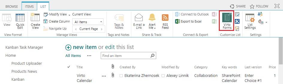
Go to a required list in your SharePoint and switch to “Library” or “List” tab. Click on Forms Designer icon on the ribbon. SharePoint Forms for Office 365 will be opened in the new window.
On the page of Virto SharePoint Forms for Office 365 you can create a form view for a folders structure or create a form view for list items in a SharePoint library.
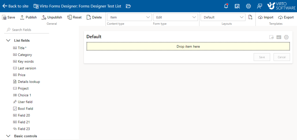
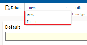
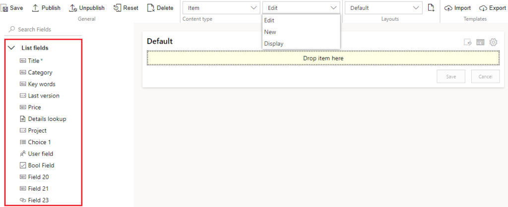
You can define the form for a list item or folder:
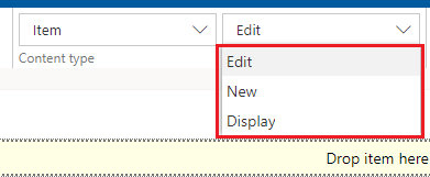
You can define the edit, view or display dorm:
All the existing fields of the list are displayed on the right.
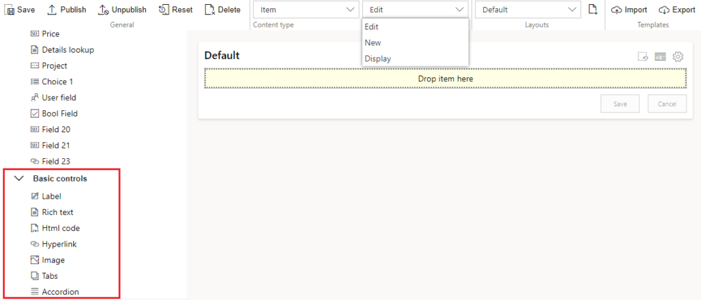
Basic controls for the SharePoint form are under the list fields.
Now you can design a SharePoint form, using drag and drop function. Pick an item and drag and drop it to the form.
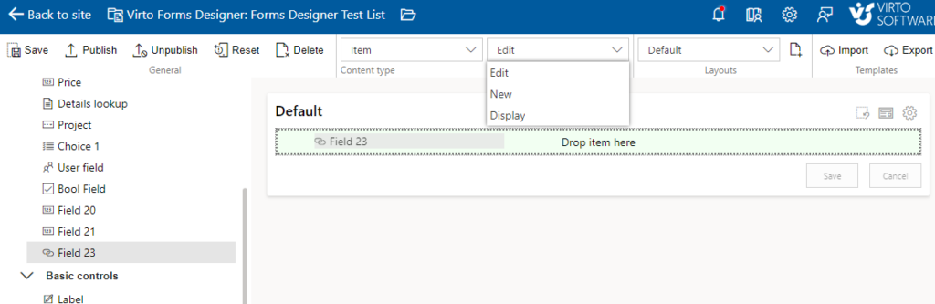
The chosen item appears in the form.
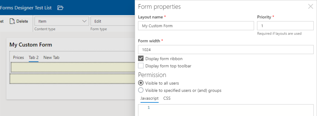
To define additional parameters of the chosen controls, click the gear icon in the right top corner of the form.
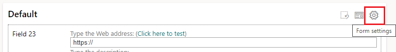
Here you can define the title of your form, its priority, width and permissions.
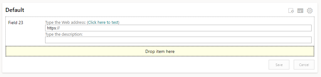
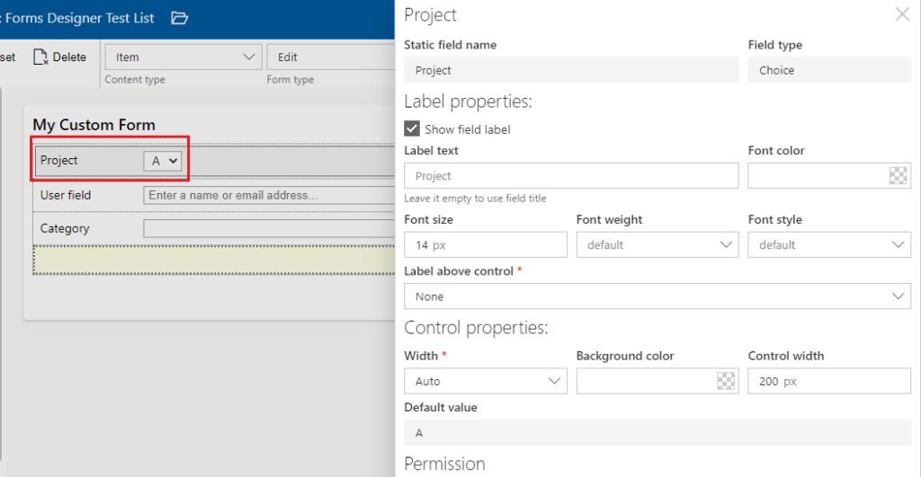
To make changes for the fields, just click the added field. Here you can change the title, define the label properties and control properties.
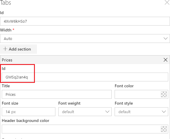
You can also adjust the appearance of controls, for example, tabs. Click the control and make the required changes: title, text color, style and size as you wish.
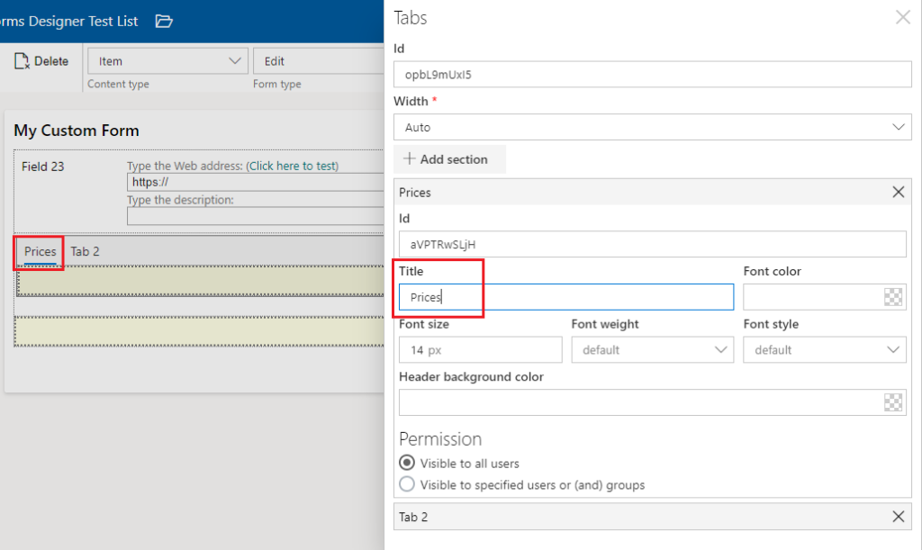
Accordion, tab, and panel have additional field ID. This code is used, when you enhance your forms with build-in JavaScript editor.
You can add any amount of sections and fields from the current list and place them in several rows under each other or locate 3 elements in a single row.
Note*: no more than 3 controls should be located in a single row.*

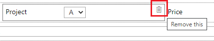
Remove chosen controls from your form by clicking “Remove” button or using drag and drop feature.
Note*: you can add any fields from the current list if you have more rights than “Read-only”.*
Note*: you can’t add fields of “Attachment” type.*
Note*: fields from the lists of “Document Library” types are not supported.*
Note*: “Recurrence” and “All day event” fields from lists of “Calendar” type are not supported.*